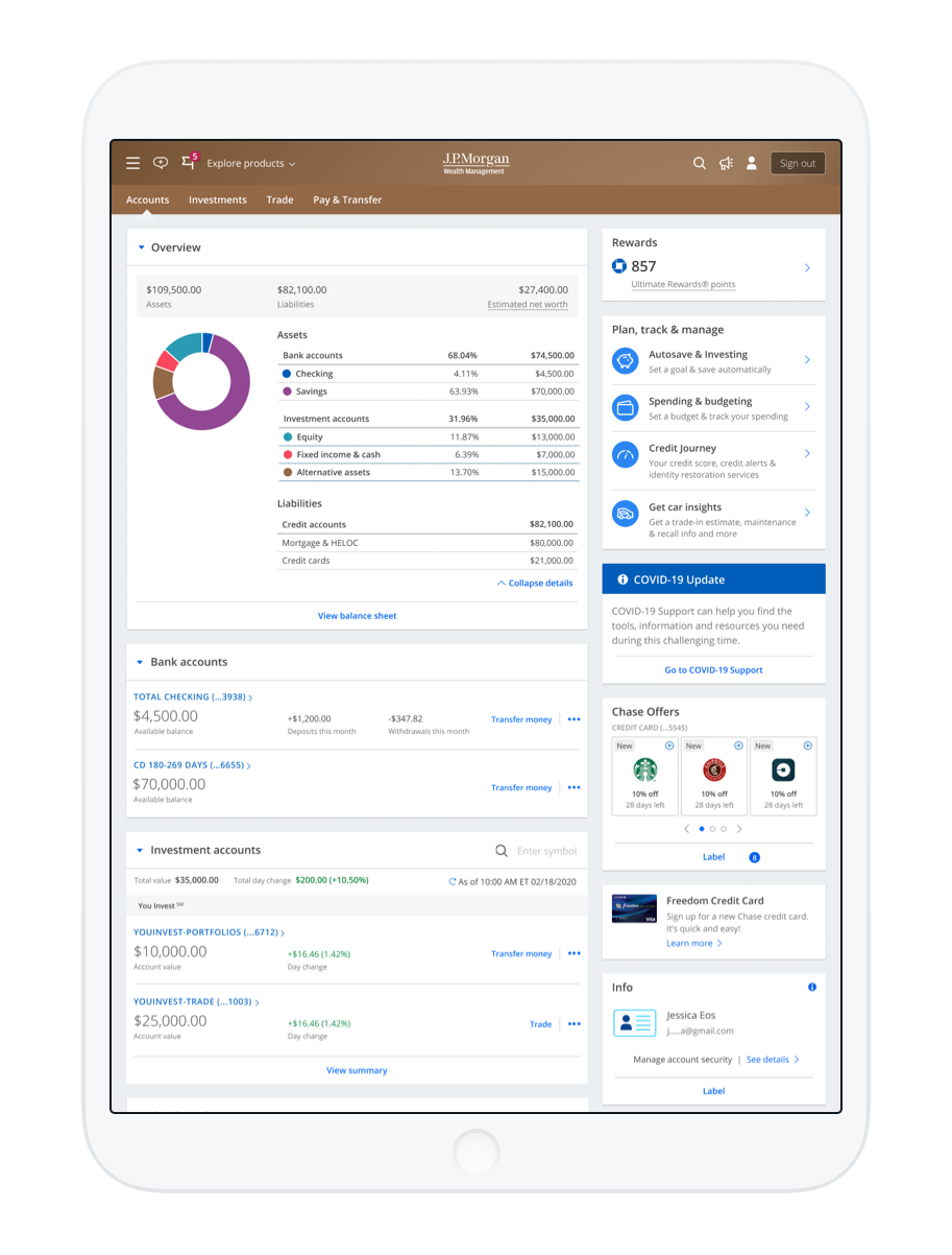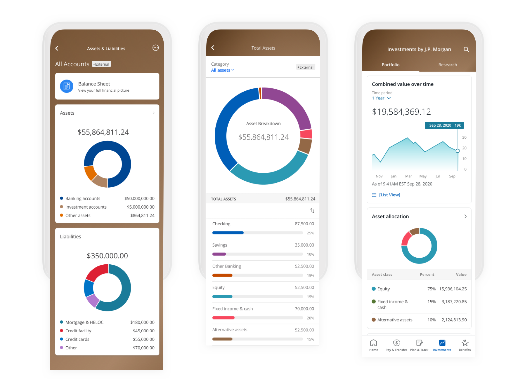
Exploring how color is applied across JPMorgan Chase family of apps
JP Morgan Chase is a multinational investment bank and financial services company. The company was launching a new product, U.S. Wealth Management, targeted towards a younger yet still premium, and more female skewing market.
Initial branding work had been completed by an agency partner, but testing showed it was not resonating well. Digital designs also failed to meet accessibility requirements. As part of an internal team, we explored color values and usage across digital applications and specifically in data visualization.

Initial designs
While the proposed marketing designs from the agency partner looked nice, they were often inconsistent and the design patterns didn’t translate well to the secure (signed-in) product experience.
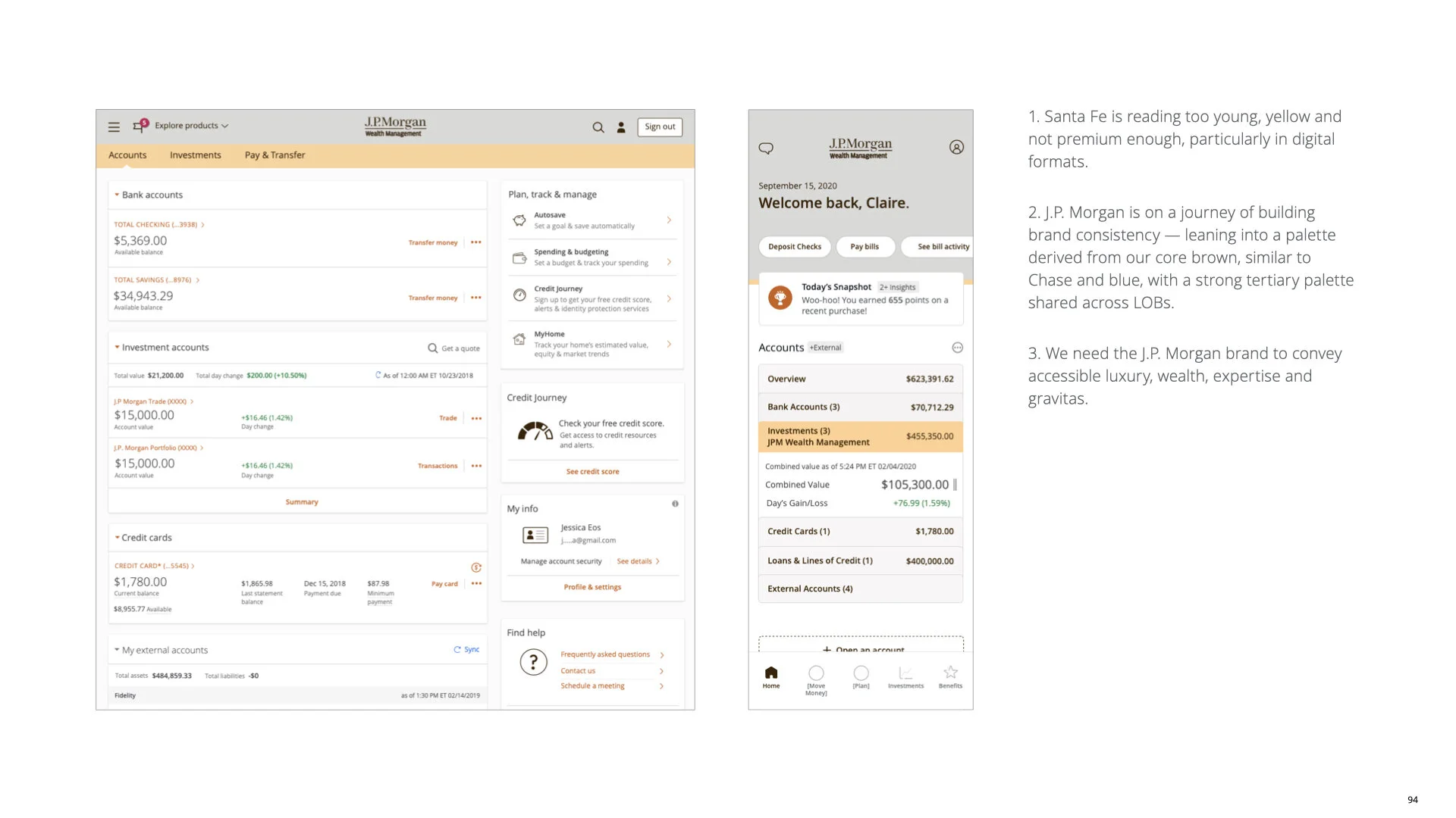

Mobile app frameworks
The existing mobile apps across JP Morgan and Chase brands we in the middle of being migrated to a single framework, with branding controlled by tokens.


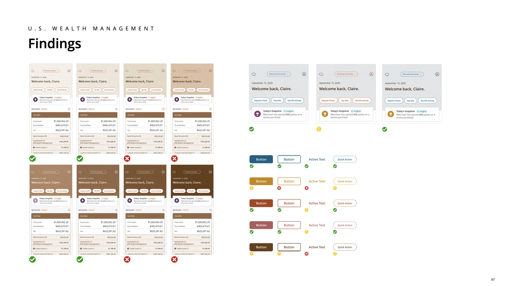
Color studies
Working from the existing core palette of browns, gray, blue, and purple, we considered varying tones to find the right mix of contemporary and luxe that would meet contrast requirements.
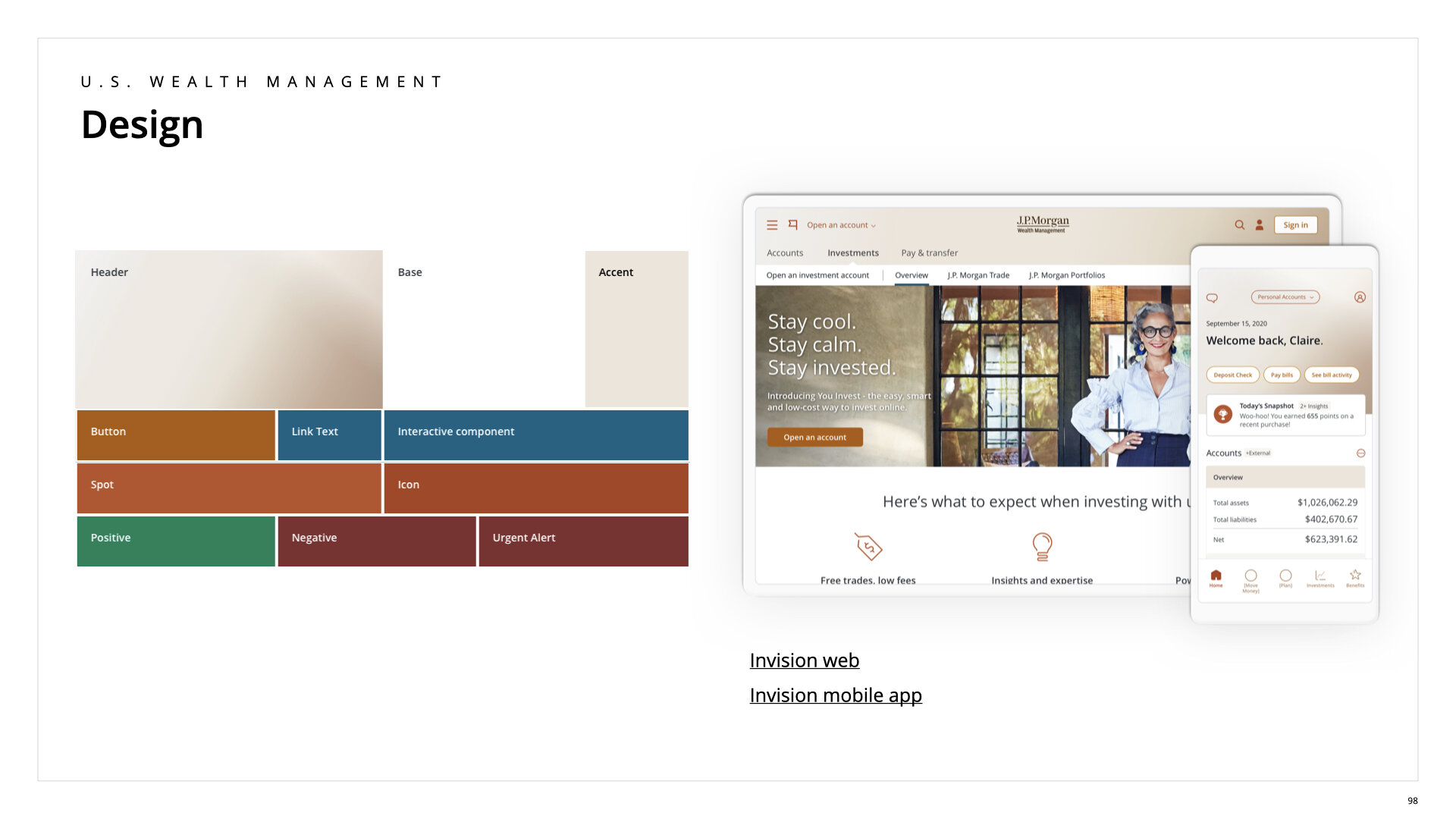
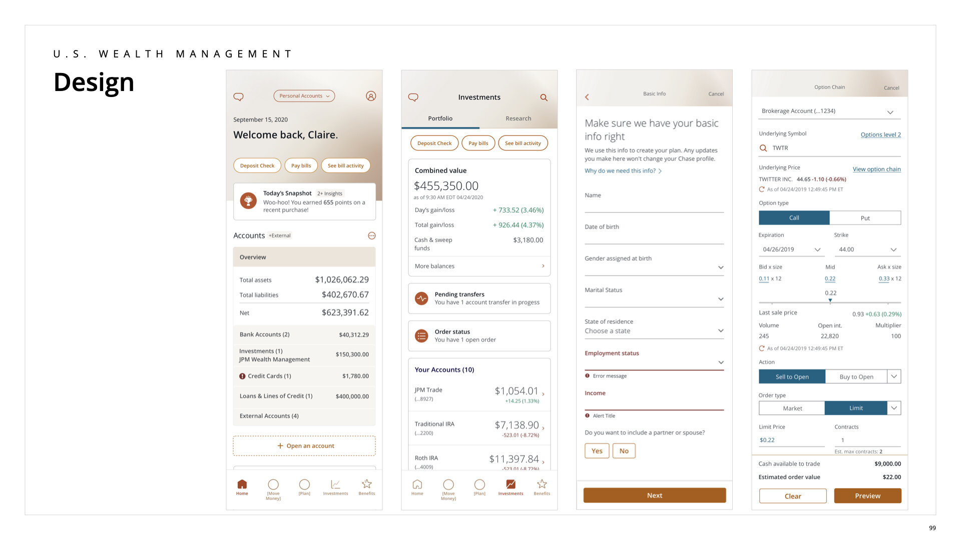


Ambient gradient log in screen
A single user can have multiple JPMorgan Chase accounts. We wanted to provide a cohesive yet unique feel to the the family of mobile apps by using tonal, shifting gradients for the log in screen.
![USWM_DataVizExplore_01282021[1]_Page_08.jpg](https://images.squarespace-cdn.com/content/v1/5d38a7de5a0b590001002185/1611956945586-6FZ5965VM5ENC7X4EASR/USWM_DataVizExplore_01282021%5B1%5D_Page_08.jpg)
![USWM_DataVizExplore_01282021[1]_Page_06.jpg](https://images.squarespace-cdn.com/content/v1/5d38a7de5a0b590001002185/1611956939205-0NOQKN2MEWYZ8F593X8Q/USWM_DataVizExplore_01282021%5B1%5D_Page_06.jpg)
![USWM_DataVizExplore_01282021[1]_Page_16.jpg](https://images.squarespace-cdn.com/content/v1/5d38a7de5a0b590001002185/1611956973759-F5S4QJ5X1CZEKD23F0VM/USWM_DataVizExplore_01282021%5B1%5D_Page_16.jpg)
![USWM_DataVizExplore_01282021[1]_Page_28.jpg](https://images.squarespace-cdn.com/content/v1/5d38a7de5a0b590001002185/1611957024393-SN5P8Z76N13K3INY1ZQ0/USWM_DataVizExplore_01282021%5B1%5D_Page_28.jpg)
![USWM_DataVizExplore_01282021[1]_Page_32.jpg](https://images.squarespace-cdn.com/content/v1/5d38a7de5a0b590001002185/1611957021809-A09060WYQ36A2AE49Y4Y/USWM_DataVizExplore_01282021%5B1%5D_Page_32.jpg)
![USWM_DataVizExplore_01282021[1]_Page_29.jpg](https://images.squarespace-cdn.com/content/v1/5d38a7de5a0b590001002185/1611957024200-EJSISTSEBWDUMNZGM45R/USWM_DataVizExplore_01282021%5B1%5D_Page_29.jpg)
![USWM_DataVizExplore_01282021[1]_Page_34.jpg](https://images.squarespace-cdn.com/content/v1/5d38a7de5a0b590001002185/1611957020867-0QYAOR9R5ES1K88AAYQS/USWM_DataVizExplore_01282021%5B1%5D_Page_34.jpg)
![USWM_DataVizExplore_01282021[1]_Page_31.jpg](https://images.squarespace-cdn.com/content/v1/5d38a7de5a0b590001002185/1611957023067-TATFQOV76IDMERUOXXHB/USWM_DataVizExplore_01282021%5B1%5D_Page_31.jpg)
![USWM_DataVizExplore_01282021[1]_Page_33.jpg](https://images.squarespace-cdn.com/content/v1/5d38a7de5a0b590001002185/1611957021437-6ODNONDN4XEYWPW2L37Y/USWM_DataVizExplore_01282021%5B1%5D_Page_33.jpg)
